Hook: Stop Washing Out Your Fabrics — Make Textiles Pop with RGBIC Lamp
You bought a gorgeous rug, splurged on velvet upholstery, or sourced heirloom curtains — and then turned on your multicolor lamp only to find everything flattened, faded, or oddly hue-shifted. If that sounds familiar, you’re not alone. Homeowners and renters in 2026 face two common frustrations: smart RGB lighting that looks spectacular in product photos but washes out real textiles, and confusing guidance on how to place multicolor lamps so fabric textures still read as rich and dimensional.
The bottom line (most important first)
RGBIC styling can make rugs, curtains, and upholstery look dramatically better — but only when you control three things: the light’s color, direction, and intensity. In practical terms: use grazing light to reveal texture, combine a neutral base (tunable white) with subtle RGB accents, and choose hues and positions that increase contrast without overwhelming the fabric’s natural color and reflectance.
Why this matters in 2026
Late 2025 and early 2026 saw mainstream RGBIC lamps finally adopt improved LED spectra and higher color-rendering performance, and the smart-home standard Matter reached a maturity level that made local, low-latency color control widely available. That means more lamps can reproduce nuanced tones and sync dynamic gradients without lag — but it also means designers and homeowners must learn how to use these capabilities to enhance (not erase) textile detail.
Quick actionable checklist (use first)
- Start with a neutral tunable-white key light (2700K–3500K) to preserve base colors.
- Introduce RGBIC accents at lower intensity (20–40%) to add color without flattening texture.
- Place lights for grazing or cross-lighting to emphasize pile, weave, and nap.
- Use color theory pairings: complementary for pop, analogous for harmony, muted triadic for modernity.
- Test with your phone camera on neutral white balance — then trust your eyes in different modes (day/night).
Understanding the tools: What RGBIC brings to textiles
RGBIC (red-green-blue with independent control) lets you map multiple colors across a single lamp or strip. In 2026, RGBIC devices commonly include:
- Segmented pixel control for gradients and multi-hue washes.
- Higher-quality phosphor LEDs with improved color rendering (many models approaching CRI 95 or using spectral tuning curves that outperform older RGB-only units).
- Hybrid white modes that blend RGB with dedicated white LEDs for truer neutrals at lower saturation.
That capability is powerful for textiles because you can create layered, dynamic effects — for example a warm “golden hour” wash on a wool rug while cooling the walls with a soft teal gradient — but the same power can wash out textures if applied as a flat, high-saturation front light. If you’re shopping, don’t miss field reviews of budget lighting & display kits that show how inexpensive strips and controllers behave in real rooms.
Core principle: Light reveals texture, color reveals mood
Always separate texture from mood in your lighting plan. Texture needs directional, low-angle, and sometimes higher-contrast light to show depth. Mood is delivered via color and saturation. When you combine them intentionally you keep fabric highlights crisp and the room emotionally resonant.
Practical translation
- Use a key tunable-white source for accurate color and texture rendering.
- Use RGBIC accents to set atmosphere and selectively boost specific fabric colors.
- Avoid placing high-saturation colors as the primary frontal light on textiles; reserve that for accents or ambient backlight.
Room-by-room styling: How to apply these rules
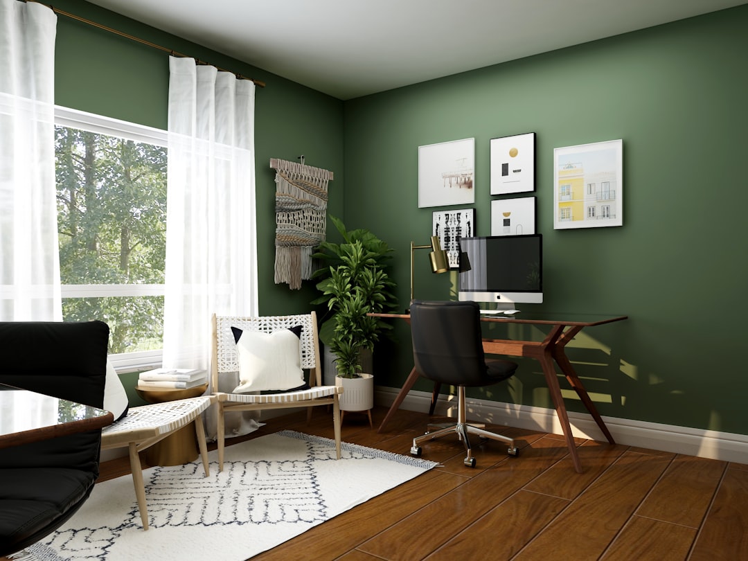
Living room — rugs and upholstery
Scenario: You have a hand-knotted rug with deep crimson and teal motifs and a mid-century velvet sofa in forest green.
- Base light: Use a floor lamp or ceiling fixture set to warm white ~3000K at moderate intensity to reveal the true tones of the rug and sofa.
- Grazing accent: Install a low-angle LED strip or adjustable torchiere aimed across the rug’s pile to bring out knot and pile texture. Keep this at 10–25% brightness.
- RGBIC color accents: Place an RGBIC table lamp or backlight behind the sofa and set it to a muted complementary tone — for a green sofa, a soft magenta/rose at low saturation will make the green appear richer without overt color spill.
- Placement rule: Keep saturated RGB light >2.5 meters from the rug if possible; use directional shades to avoid broad wash on high-contrast areas.
Bedroom — curtains and upholstery
Scenario: Sheer linen curtains and a velvet headboard.
- Backlight the curtains with a gradient using RGBIC strips set to warm peach-to-amber for a sunrise effect; these colors warm the room and make linen textures glow. Keep intensity low so the weave reads.
- Use a bedside RGBIC lamp with a narrow beam to accent one side of the headboard with a slightly cooler or deeper hue to add contrast and make the velvet pile pop.
- Avoid high-saturation cyan/pure blue on both curtains and headboard; those tones tend to flatten warm fabrics and can make linens look washed out.
Dining room — table textiles and runners
Scenario: A woven table runner and patterned napkins.
- Overhead pendants should be tunable white with a CRI above 90 to show true colors of linens.
- Add small RGBIC uplights in niches or behind plants that project soft complementary highlights on table edges; keep them at low saturation and use gel-like gradients that avoid direct overhead spill.
Placement rules that actually work
- Rule 1 — Key light first: A neutral, accurate white light must be the dominant source for textiles. RGBIC accents should never be the sole light on a fabric-heavy area.
- Rule 2 — Grazing is your friend: Place low-angle lights 12–24 inches from the surface for rugs and upholstery to reveal texture. For curtains, backlight from behind or below to define weave.
- Rule 3 — Distance and intensity: Keep saturated colors at <40% intensity when closer than 1.5 meters. Halve intensity if within 1 meter.
- Rule 4 — Layering: Use 2–3 layers: ambient (soft white), task (tunable white), accent (RGBIC). Let the accent be the smallest contributor to lux on fabric surfaces.
- Rule 5 — Beam control: Use lamps with adjustable heads, diffusers, or shades to focus color precisely; avoid wide uncontrolled spill on large textiles.
Color theory made practical for fabrics and light
Color theory helps you choose hues that enhance — rather than compete with — fabric colors. Here are field-ready pairings and prescriptions for common fabric colors.
Neutral fabrics (linen, beige, gray)
Goal: Preserve texture while adding mood.
- Pair with warm ambers and soft mauves for cozy evenings.
- For a modern feel, use muted teal or desaturated indigo at low intensity behind sideboards or drapery folds.
Warm fabrics (red, terracotta, mustard)
Goal: Avoid oversaturation that flattens weave.
- Complement with cool teals or soft blues at low intensity to increase perceived color depth.
- Analogous pairings (deep orange with warm amber) work well for period-style rooms — keep saturation moderate.
Cool fabrics (blues, greens)
Goal: Boost richness without making fabrics appear cold.
- Use muted magenta or golden accents to lift midtones.
- Deep indigo fabrics tolerate richer blues; use narrow-beam saturated blue only as a rim light rather than frontal wash.
Velvet and high-pile fabrics
Velvet responds exceptionally to directional light — the nap reveals highlights and shadows. To leverage that:
- Gently sweep a low-angle warm white across the surface, then add a thin rim of color for drama. A cool rim on warm velvet (and vice versa) heightens contrast and makes the pile look richer.
Practical color settings (start points)
Every lamp and app uses different coordinates, but these starting points translate across most platforms. Use them as baseline and adjust by eye.
- Warm neutral base: Tunable white 2700K–3000K at 60–80% brightness.
- Accent pop (complementary): For greens — soft magenta (Hue ~320°, Sat 30–40%), brightness 20–30%.
- Sunset-wash for linens: Gradient from 2800K to RGB amber (Hue ~35°, Sat 40%) at 15–35% brightness.
- Cool modern lift: Muted teal on walls behind textiles (Hue ~190°, Sat 25–35%) at 10–25% brightness.
How to test — quick workflow
- Set your key tunable white and evaluate fabric color at daytime brightness (50–75%).
- Add an RGBIC accent at low intensity and toggle between analogous and complementary hues to see which preserves texture and increases contrast.
- Change your viewing angle: get low to the floor for rugs and close to the fabric for upholstery. Texture reveals differently at different angles.
- Confirm in phone camera with neutral white balance and then with auto — cameras exaggerate; trust physical sight as final judge.
Case study: Transforming a rental living room (real-world example)
I worked with a renter in late 2025 who had a mid-tone Persian rug, cream linen curtains, and a navy sofa. Their problem: saturated smart lights made the rug look flat and curtains lost their warm texture.
- We installed a tunable-white floor lamp (3000K) as the key light and set it to 65% brightness.
- Added an RGBIC floor lamp with segmented pixels behind the sofa. We chose a low-saturation warm magenta gradient to add depth to the navy sofa without coloring the rug directly.
- Used a hidden RGBIC strip under the window sill for a soft sunset wash on the linen curtains at 20% brightness, shifting from amber to soft peach over 15 minutes for evening ambiance.
- Grazing light across the rug from a tucked LED puck emphasized the knot texture and increased perceived contrast.
Result: Textiles read richer, the navy sofa looked deeper, and the Persian rug’s pattern popped without appearing artificially colored. The renter reported fewer complaints about “weird colors” from guests and higher satisfaction for hosting photos.
Common mistakes and quick fixes
- Mistake: Using saturated RGB as the main frontal light. Fix: Make a white tunable light the primary source and use RGBIC only for accents.
- Mistake: Placing RGB lights too close to delicate textiles. Fix: Increase distance, add diffusers, or lower intensity.
- Mistake: All lights same hue. Fix: Layer at least one neutral white and one colored accent to retain depth.
2026 trends and future-forward tips
As we move deeper into 2026, expect a few developments to influence textile styling with smart lamps:
- Better spectral LEDs: More RGBIC lights will include broader spectra or hybrid white channels, making neutrals truer and allowing safer use of low-saturation color near fabrics.
- AI-assisted presets: Brands now ship preset scenes trained on textile photography datasets — use those as starting points but tweak intensity and beam angles locally.
- Matter and local control: With Matter matured, synchronized multi-lamp scenes will switch instantly and reliably; use grouped scenes for coordinated fabric highlights across rooms.
Pro tip: In 2026, look for RGBIC lamps that publish their spectral power distribution (SPD) or advertise high CRI/TM-30 scores — those metrics predict how faithfully a lamp will render subtle textile hues.
Product selection checklist (buying tips)
- Prefer lamps that support a hybrid white mode or have dedicated white LEDs in addition to RGB.
- Check CRI/RA and TM-30 values; higher is better for textiles.
- Choose adjustable-beam fixtures and fixtures compatible with Matter for better scene control in 2026 ecosystems.
- Look for apps that allow per-segment control (essential for RGBIC gradients) and fine control of saturation and intensity.
Final checklist before styling your room
- Set a neutral base light with good CRI at the right brightness.
- Add grazing or cross-lighting to reveal texture.
- Introduce RGBIC accents at low saturation and controlled beams.
- Use color theory: complementary for punch, analogous for calm, triadic for a modern layered look.
- Test across times of day and from multiple angles.
Actionable takeaways
- Texture-first, color-second: Always secure an accurate white light for textiles before adding RGB drama.
- Grazing reveals detail: Low-angle light is the single most effective technique for making carpets and upholstery read as luxurious.
- Keep saturation low near fabric: High-saturation colors flatten detail — use them as rim or backlight instead.
- Leverage 2026 tech: Use hybrid-white RGBIC lamps and Matter-enabled scenes to coordinate multi-light setups that protect fabric tones.
Closing: Make your textiles the star — confidently
RGBIC lamps are powerful styling tools in 2026, but their potential is realized only when you pair technical control with an understanding of textiles. Use directional light to reveal weave and pile, reserve saturated color for accents, and start with a neutral, high-CRI base. Follow the placement rules and color pairings above and you’ll transform rugs, curtains, and upholstery from flat backgrounds into dynamic, textured focal points.
Ready to try it? Start with a single RGBIC lamp and a tunable-white key light. Test the pairing on one textile (a rug or sofa) using the presets above. If it works, scale to multiple lamps and build coordinated scenes — your fabrics will thank you.
Call to action
Want a step-by-step plan tailored to your room? Share a photo of your space or describe the textiles and lamp options you own — we’ll send a customized lighting recipe (hues, intensities, and placement) to make your fabrics pop without losing texture.
Related Reading
- Lighting That Remembers: How Hybrid Smart Chandeliers and Purposeful Light Shape Reflective Spaces in 2026
- Field Review: Budget Lighting & Display Kits That Transform Pound‑Store Windows (2026)
- The Sleep-Boosting Bedroom Setup: Smart Lamps, Wearables and Warmth
- Hands-On Review: LED Gem Lightbox Pro — Field Test for Photographers & Sellers (2026)
- From Convenience Store Shelves to Your Table: What Asda Express Expansion Means for Fresh Seafood Access
- From Vacuum to Windex: Proper Cleaning Tools for Watch Storage and Straps
- Parts and After-Sales Strategy for Micromobility Fleets: Building a Reliable Spare-Parts Pipeline
- Create a Family Playlist: Teaching Emotional Vocabulary with New Music Releases
- Citrus on the Campfire: 8 Easy Camp Cooking Recipes Using Citrus Varieties